
代码如下
<!DOCTYPE html>
<html lang="zh-CN">
<head>
<meta charset="UTF-8">
<meta name="viewport" content="width=device-width, initial-scale=1.0">
<title>子比主题 - 红蓝光条动态环绕效果</title>
<link rel="stylesheet" href="https://cdnjs.cloudflare.com/ajax/libs/font-awesome/6.4.0/css/all.min.css">
<style>
* {
margin: 0;
padding: 0;
box-sizing: border-box;
font-family: 'Segoe UI', Tahoma, Geneva, Verdana, sans-serif;
}
body {
background: linear-gradient(135deg, #0c0c1d, #1a1a3a);
color: #e0e0ff;
min-height: 100vh;
display: flex;
justify-content: center;
align-items: center;
padding: 20px;
}
.container {
max-width: 1200px;
width: 100%;
text-align: center;
}
header {
margin-bottom: 50px;
animation: fadeInDown 1s ease;
}
h1 {
font-size: 3.2rem;
margin-bottom: 15px;
background: linear-gradient(90deg, #ff0058, #00b3ff);
-webkit-background-clip: text;
background-clip: text;
color: transparent;
text-shadow: 0 0 20px rgba(255, 0, 88, 0.3);
letter-spacing: 1px;
}
.subtitle {
font-size: 1.3rem;
opacity: 0.85;
max-width: 700px;
margin: 0 auto;
line-height: 1.6;
color: #c0c0ff;
}
.gallery {
display: flex;
justify-content: center;
flex-wrap: wrap;
gap: 60px;
margin-top: 40px;
}
.glow-card {
position: relative;
width: 280px;
height: 280px;
display: flex;
justify-content: center;
align-items: center;
border-radius: 20px;
overflow: hidden;
box-shadow: 0 0 50px rgba(0, 0, 0, 0.4);
transition: transform 0.4s ease;
}
.glow-card:hover {
transform: scale(1.05);
}
.glow-card::before {
content: '';
position: absolute;
width: 120%;
height: 120%;
background: conic-gradient(
transparent, transparent, transparent, #ff0058,
transparent, transparent, transparent, #00b3ff,
transparent, transparent, transparent, #ff0058
);
animation: rotateBorder 4s linear infinite;
}
.glow-card::after {
content: '';
position: absolute;
width: 120%;
height: 120%;
background: conic-gradient(
transparent, transparent, transparent, #00b3ff,
transparent, transparent, transparent, #ff0058,
transparent, transparent, transparent, #00b3ff
);
animation: rotateBorderReverse 3s linear infinite;
}
.glow-card:hover::before,
.glow-card:hover::after {
animation-duration: 1.5s;
}
.image-wrapper {
position: relative;
width: 94%;
height: 94%;
border-radius: 16px;
overflow: hidden;
z-index: 10;
background: linear-gradient(45deg, #1c1c3a, #121230);
display: flex;
align-items: center;
justify-content: center;
box-shadow: 0 0 30px rgba(0, 0, 0, 0.6);
}
.image-wrapper img {
width: 100%;
height: 100%;
object-fit: cover;
transition: transform 0.5s ease;
}
.glow-card:hover .image-wrapper img {
transform: scale(1.08);
}
.inner-glow {
position: absolute;
width: 100%;
height: 100%;
border-radius: 16px;
box-shadow:
inset 0 0 15px rgba(255, 0, 88, 0.6),
inset 0 0 25px rgba(0, 179, 255, 0.4);
z-index: 11;
pointer-events: none;
}
.caption {
margin-top: 25px;
font-size: 1.3rem;
font-weight: 600;
color: #fff;
text-shadow: 0 0 10px rgba(0, 179, 255, 0.5);
letter-spacing: 1px;
}
.code-section {
background: rgba(20, 20, 40, 0.7);
border-radius: 20px;
padding: 30px;
margin: 60px auto 40px;
max-width: 900px;
box-shadow: 0 10px 30px rgba(0, 0, 0, 0.4);
backdrop-filter: blur(10px);
border: 1px solid rgba(255, 255, 255, 0.08);
}
.code-header {
display: flex;
justify-content: space-between;
align-items: center;
margin-bottom: 25px;
}
.code-title {
font-size: 1.8rem;
color: #00b3ff;
display: flex;
align-items: center;
gap: 12px;
}
.copy-btn {
background: linear-gradient(to right, #ff0058, #9900cc);
color: white;
border: none;
padding: 12px 25px;
border-radius: 8px;
cursor: pointer;
font-weight: 600;
font-size: 1rem;
transition: all 0.3s;
display: flex;
align-items: center;
gap: 8px;
}
.copy-btn:hover {
transform: translateY(-3px);
box-shadow: 0 5px 15px rgba(255, 0, 88, 0.4);
}
pre {
background: #0d0d1a;
padding: 25px;
border-radius: 12px;
overflow-x: auto;
font-size: 1rem;
line-height: 1.5;
color: #e0e0ff;
border: 1px solid rgba(255, 255, 255, 0.05);
}
footer {
margin-top: 40px;
padding: 25px;
color: #a0a0c0;
font-size: 0.9rem;
border-top: 1px solid rgba(255, 255, 255, 0.05);
}
@keyframes rotateBorder {
0% {
transform: rotate(0deg);
}
100% {
transform: rotate(360deg);
}
}
@keyframes rotateBorderReverse {
0% {
transform: rotate(360deg);
}
100% {
transform: rotate(0deg);
}
}
@keyframes fadeInDown {
from {
opacity: 0;
transform: translateY(-30px);
}
to {
opacity: 1;
transform: translateY(0);
}
}
@media (max-width: 768px) {
h1 {
font-size: 2.5rem;
}
.subtitle {
font-size: 1.1rem;
}
.gallery {
gap: 40px;
}
.glow-card {
width: 250px;
height: 250px;
}
}
</style>
</head>
<body>
<div class="container">
<header>
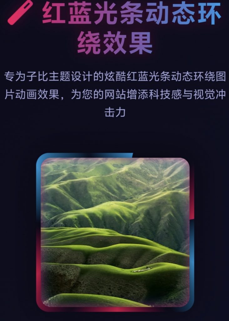
<h1><i class="fas fa-magic"></i> 红蓝光条动态环绕效果</h1>
<p class="subtitle">专为子比主题设计的炫酷红蓝光条动态环绕图片动画效果,为您的网站增添科技感与视觉冲击力</p>
</header>
<div class="gallery">
<div class="gallery-item">
<div class="glow-card">
<div class="image-wrapper">
<img src="https://images.unsplash.com/photo-1501854140801-50d01698950b?auto=format&fit=crop&w=600" alt="山脉风景">
<div class="inner-glow"></div>
</div>
</div>
<div class="caption">山脉之光</div>
</div>
<div class="gallery-item">
<div class="glow-card">
<div class="image-wrapper">
<img src="https://images.unsplash.com/photo-1470071459604-3b5ec3a7fe05?auto=format&fit=crop&w=600" alt="自然风景">
<div class="inner-glow"></div>
</div>
</div>
<div class="caption">森林秘境</div>
</div>
<div class="gallery-item">
<div class="glow-card">
<div class="image-wrapper">
<img src="https://images.unsplash.com/photo-1475924156734-496f6cac6ec1?auto=format&fit=crop&w=600" alt="海滩风景">
<div class="inner-glow"></div>
</div>
</div>
<div class="caption">海洋之心</div>
</div>
</div>
<div class="code-section">
<div class="code-header">
<h2 class="code-title"><i class="fas fa-code"></i> 实现代码</h2>
<button class="copy-btn" id="copyBtn"><i class="fas fa-copy"></i> 复制代码</button>
</div>
<pre><code>/* 红蓝光条动态环绕图片效果 */
.glow-card {
position: relative;
width: 280px;
height: 280px;
display: flex;
justify-content: center;
align-items: center;
border-radius: 20px;
overflow: hidden;
box-shadow: 0 0 50px rgba(0, 0, 0, 0.4);
transition: transform 0.4s ease;
}
.glow-card:hover {
transform: scale(1.05);
}
.glow-card::before {
content: '';
position: absolute;
width: 120%;
height: 120%;
background: conic-gradient(
transparent, transparent, transparent, #ff0058,
transparent, transparent, transparent, #00b3ff,
transparent, transparent, transparent, #ff0058
);
animation: rotateBorder 4s linear infinite;
}
.glow-card::after {
content: '';
position: absolute;
width: 120%;
height: 120%;
background: conic-gradient(
transparent, transparent, transparent, #00b3ff,
transparent, transparent, transparent, #ff0058,
transparent, transparent, transparent, #00b3ff
);
animation: rotateBorderReverse 3s linear infinite;
}
.glow-card:hover::before,
.glow-card:hover::after {
animation-duration: 1.5s;
}
.image-wrapper {
position: relative;
width: 94%;
height: 94%;
border-radius: 16px;
overflow: hidden;
z-index: 10;
background: linear-gradient(45deg, #1c1c3a, #121230);
display: flex;
align-items: center;
justify-content: center;
box-shadow: 0 0 30px rgba(0, 0, 0, 0.6);
}
.image-wrapper img {
width: 100%;
height: 100%;
object-fit: cover;
transition: transform 0.5s ease;
}
.glow-card:hover .image-wrapper img {
transform: scale(1.08);
}
.inner-glow {
position: absolute;
width: 100%;
height: 100%;
border-radius: 16px;
box-shadow:
inset 0 0 15px rgba(255, 0, 88, 0.6),
inset 0 0 25px rgba(0, 179, 255, 0.4);
z-index: 11;
pointer-events: none;
}
@keyframes rotateBorder {
0% { transform: rotate(0deg); }
100% { transform: rotate(360deg); }
}
@keyframes rotateBorderReverse {
0% { transform: rotate(360deg); }
100% { transform: rotate(0deg); }
}</code></pre>
</div>
<footer>
<p>子比主题红蓝光条动态环绕效果 © 2023 - 提升网站视觉体验</p>
<p>提示:此效果使用纯CSS实现,兼容现代浏览器,可轻松集成到子比主题中</p>
</footer>
</div>
<script>
document.getElementById('copyBtn').addEventListener('click', function() {
const code = document.querySelector('pre').innerText;
navigator.clipboard.writeText(code).then(() => {
const originalText = this.innerHTML;
this.innerHTML = '<i class="fas fa-check"></i> 已复制!';
setTimeout(() => {
this.innerHTML = originalText;
}, 2000);
});
});
</script>
</body>
</html>感谢您的来访,获取更多精彩文章请收藏本站。
THE END


暂无评论内容